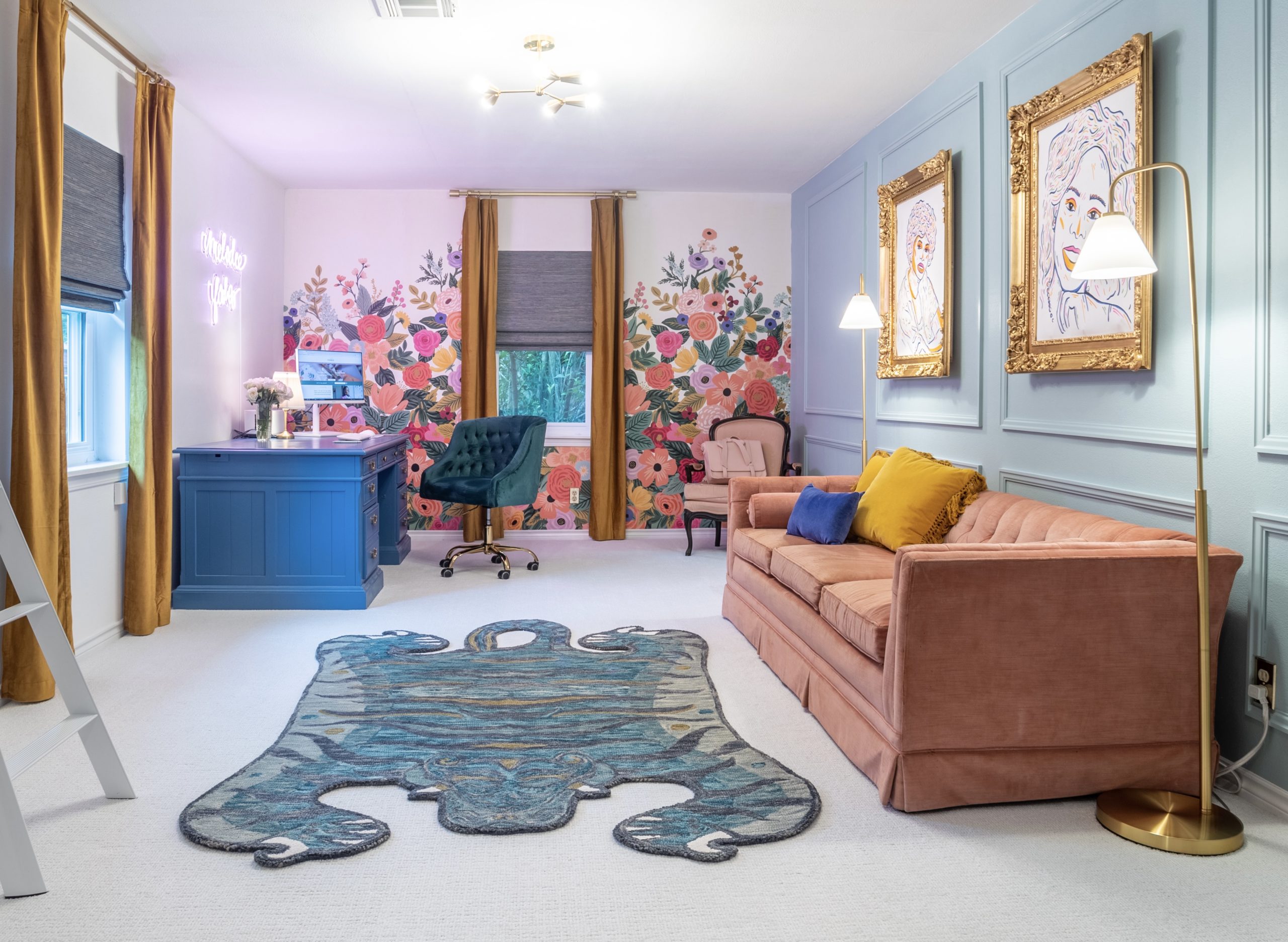
Your environment impacts your mindset and your energy impacts your creativity. You deserve to enter a room that when looking at the walls, it not only makes you smile, but stand tall. Because when you enter, it reminds you of the Queen that you are.
This is how my new studio home office makes me feel everyday.

But it didn’t start out that way, here’s the before photo:
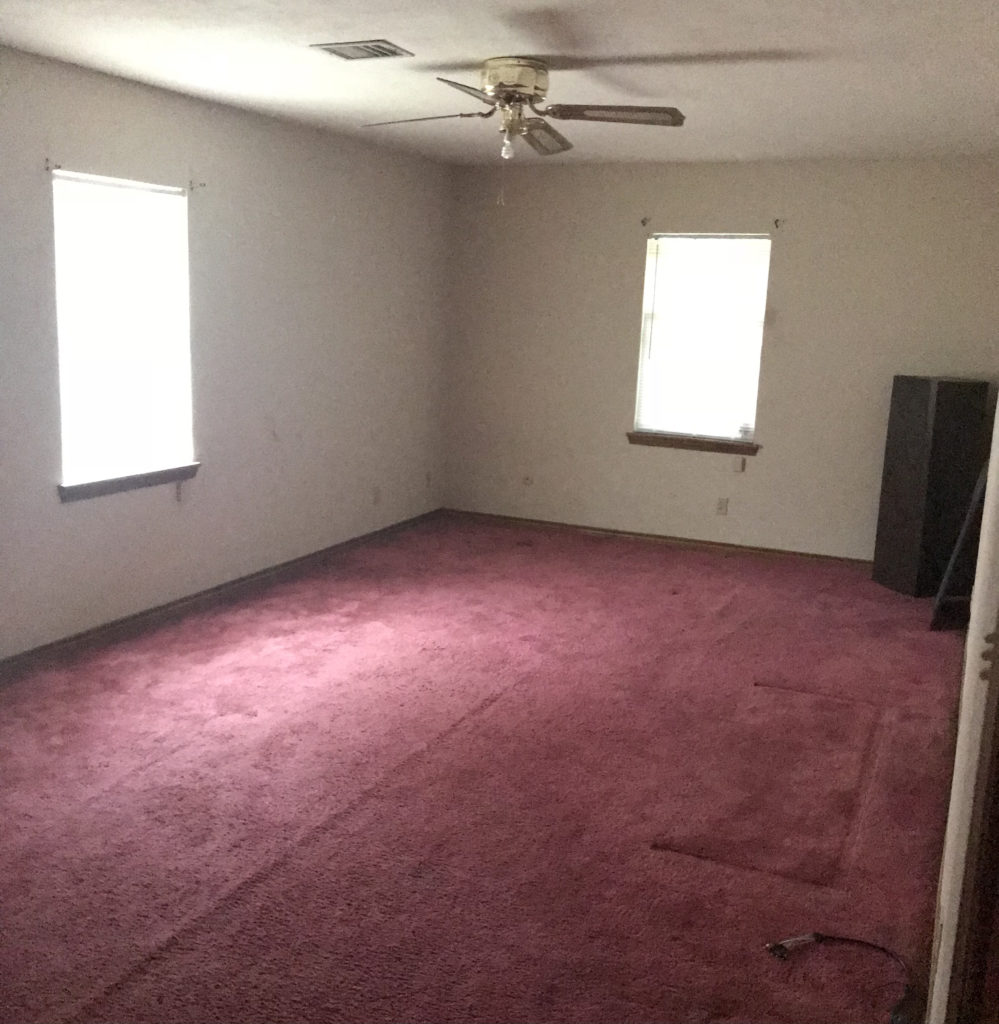
My goal for this office was simple: to be a beautiful and functional environment to work, create (record), and lounge. I also knew that I didn’t want boring beige, or trendy gray to be a part of it. The use of color isn’t popular, and yet I’m a firm believer that my life is better with color.
Accent Wall: The Wall of Honor
1. How will I honor those who’ve made a positive impact on my life?
2. How will it look in the background when I’m creating video content?
3. How will the color compliment the wallpaper?
Those are the 3 questions that I asked when it came to my accent wall.
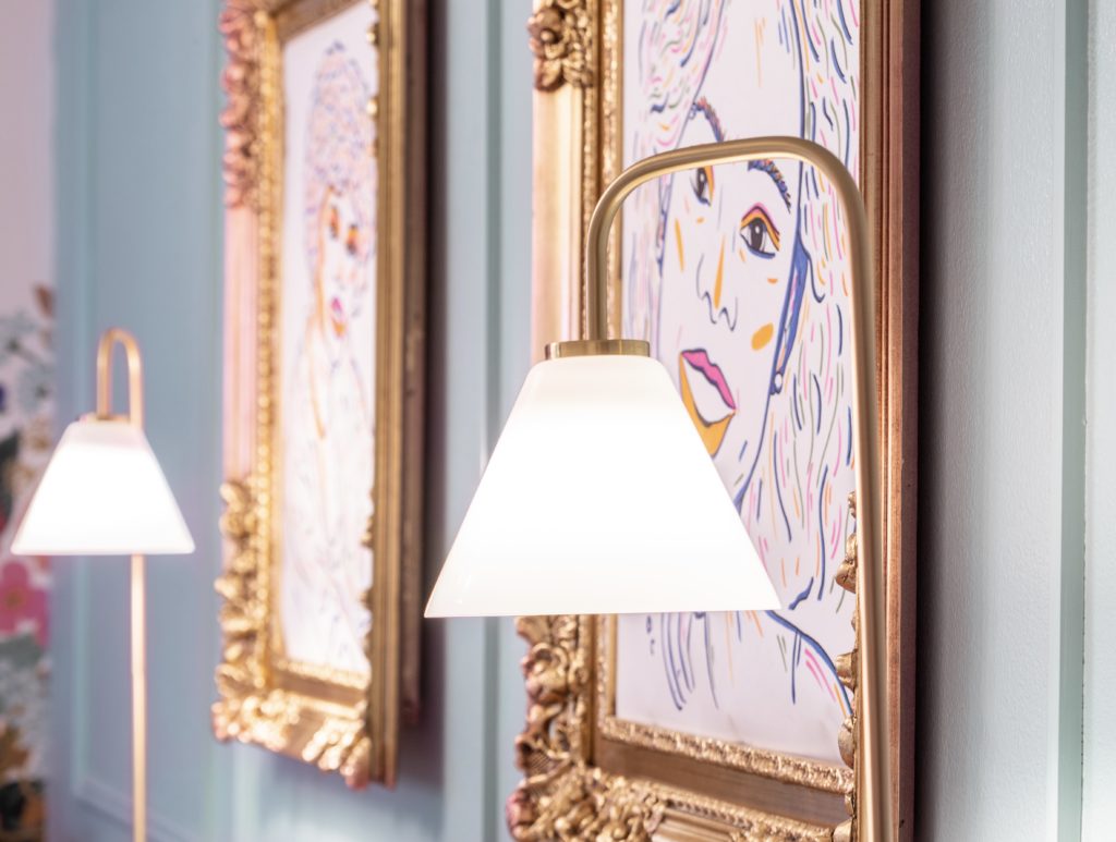
At first I was going to call it “the wall of the dead” which sounds slightly morbid, but in truth it was important to honor the people who’ve made a positive impact on my life who are no longer here. I had a vision of the faces of powerful black women in history on my accent wall.
Women who took radical responsibility, transformed environments by their very presence, dared to risk when it would’ve been easy to play it safe and stay small, beautiful examples of what’s possible regardless of the current culture, climate, or controversy. Women like Harriet Tubman, Madam C.J. Walker, Rosa Parks, Queen Esther and many others.
And as I kept adding women to the list, another face would come up, then another, and it became so much. I was like, “oh no! There’s no way I can handle looking at that many faces. My wall will be too cluttered and it’ll be too much of a distraction when I create video content.”
But still there was this lingering desire to honor. So I asked myself, “who are the two women who are no longer here that have impacted me most?” and instantaneously my Mother and Grandmother came to mind.
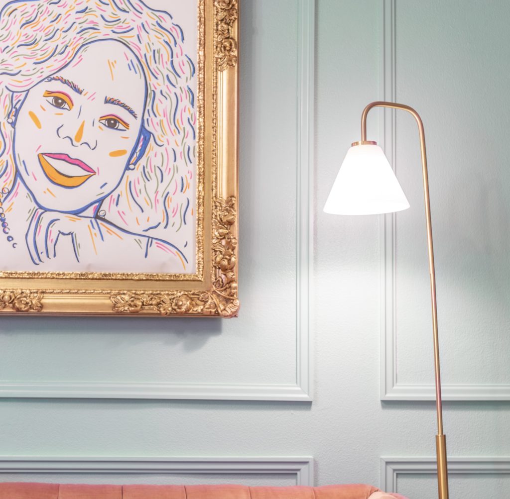
After making that decision, I knew I wanted their photos to be displayed differently. I didn’t want black & white, or color photographs that were blown up. I also didn’t want a traditional painting either. I found an incredible artist that when I shared with her my vision, color palette, sizing— she made it come to life in the most beautiful way.
the inspiration
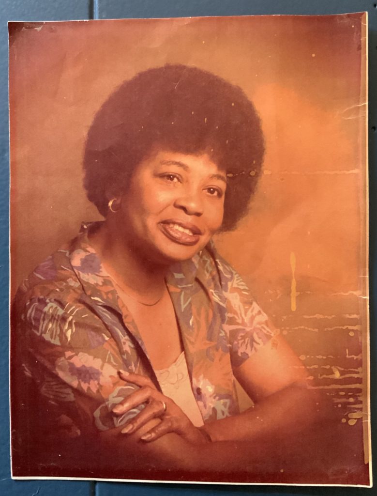

the manifestation
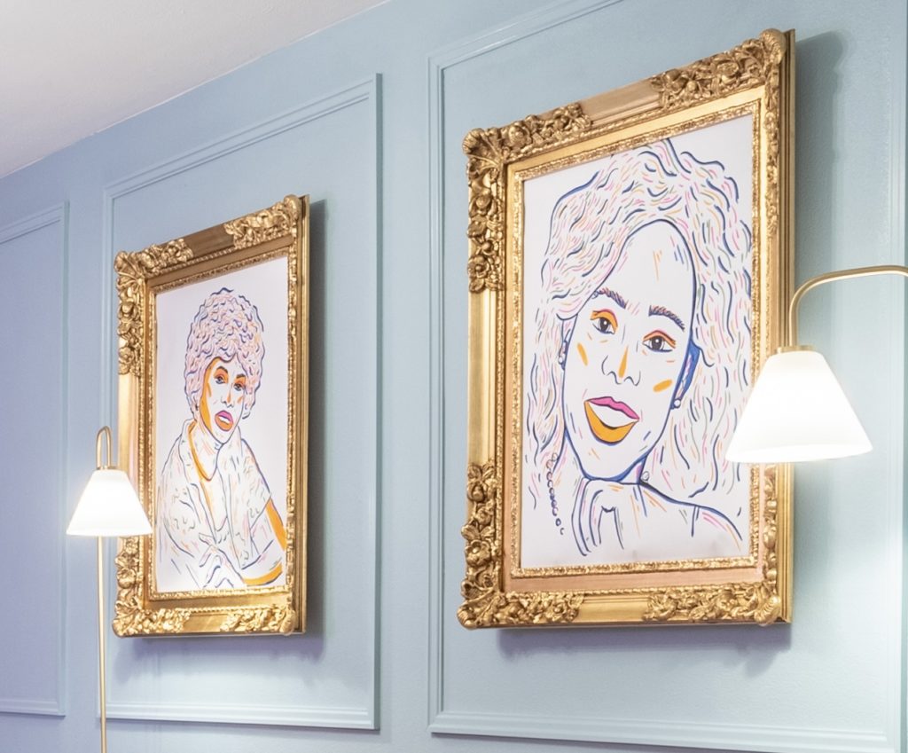
The art dressed in these stunning gold frames makes my mouth drop, my belly tingle and my toes curl in pride & gratitude every time.
What I Find Funny: Both my Grandmother and Mother were very involved in interior design and would take me to furniture stores, antique shops, etc. as a girl and I DETESTED those trips. “Mom, I’m ready to go!!” I’d pout. I bet they’re both having quite the chuckle now! Seeds were planted and now they’re blooming.
Then, of course there was the accent wall color and this was an area of contention. I went back and forth so much as color is an important factor and really impacts the overall feel and energy of a room. Too dark and you feel like you’re in a cave and too bright and you feel like you’re in a circus. There’s a knack to color and so I had my swatches on the wall.
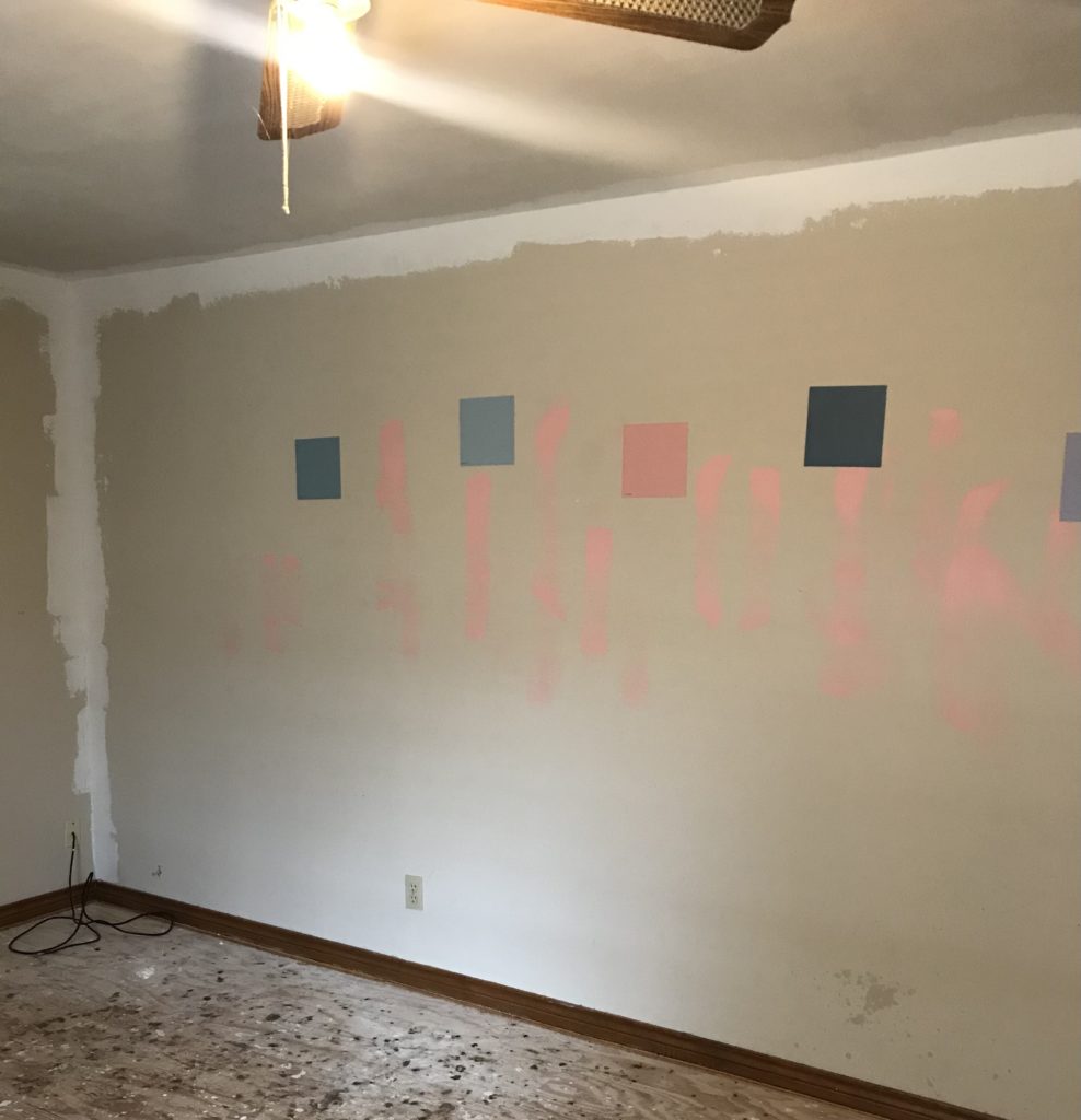
Originally I was planning on going with a blue like a blue jean denim blue. But at the last minute I swapped it, (because my gut felt it was too dark) and went with what’s called: nairobi blue.
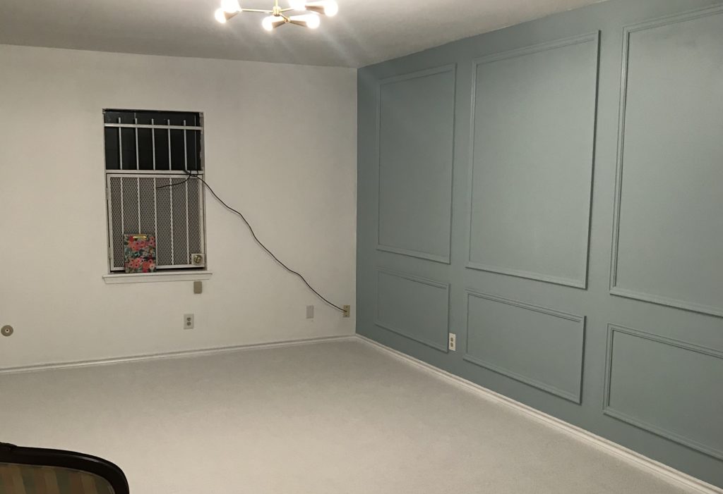
I was still unsure about it as I felt it was more green than blue, and I’ve never been a green girl. But I was pleasantly surprised by how well it went with the wallpaper.
Also, don’t we love paneling? My contractor was awesome in nailing exactly what I wanted when I showed him my design plan. Wainscoting, crown molding, chair rail, paneling and trim can really add a classic elegant look to your accent wall.
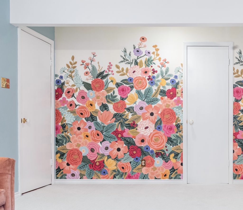
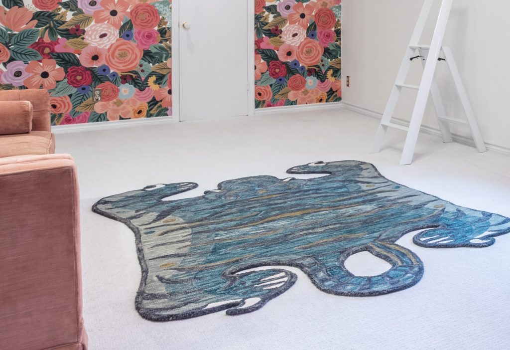
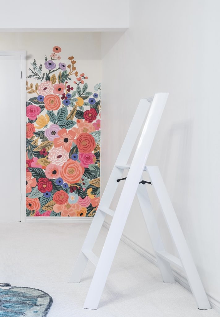
Wallpaper: isn’t exclusive to granny, honey.
I never thought I’d use wallpaper in this room (or any room for that matter). I always thought wallpaper was for grannies and elderly people, not for young people who valued fun. Boy was I wrong!
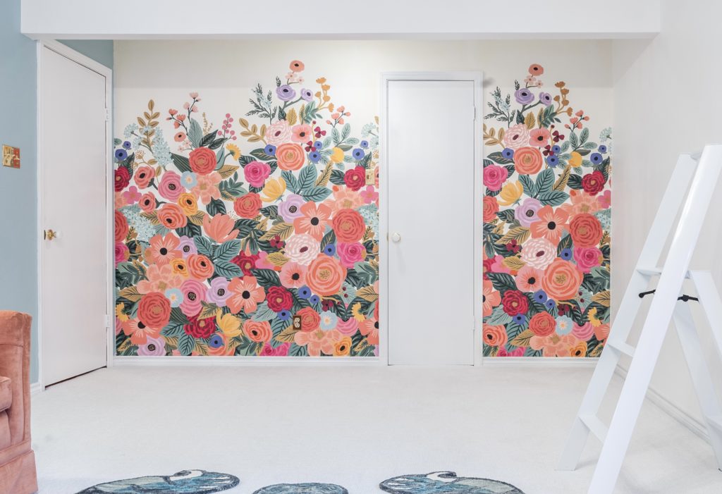
It was love at first sight when I saw this wallpaper. Like when I walked the streets of London, England for the first time and my heart instantly felt at home. The right wallpaper can add so much joy to a room.
What I Love: when a visitor comes by and says, “oh I love the painting. Who painted the flowers? It’s beautiful.” and when I tell them it’s WALLPAPER their face gives me a double take!
Window Dressing: draperies aren’t dead.
As a home improvement professional that has been in the window covering industry for 5 years, I’m biased towards shutters. Why? To sum it up: Blinds are basic. Shutters make a statement. They are classic, timeless, beautiful, functional and practically perfect in every way. And I love them.
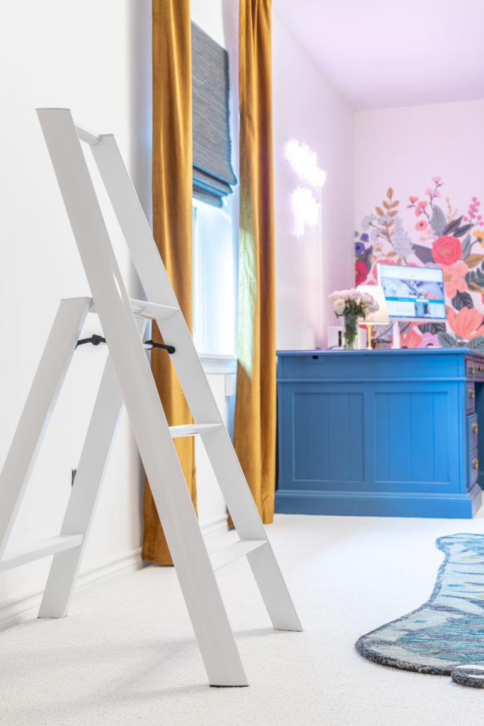
But you know what’s odd? I wasn’t feeling them for this room. I wanted a softer treatment, (especially after getting new windows) that would allow me to enjoy the clear view that the new windows provided me. More specifically, I wanted the functionality of a blind, and the beauty of a shade.
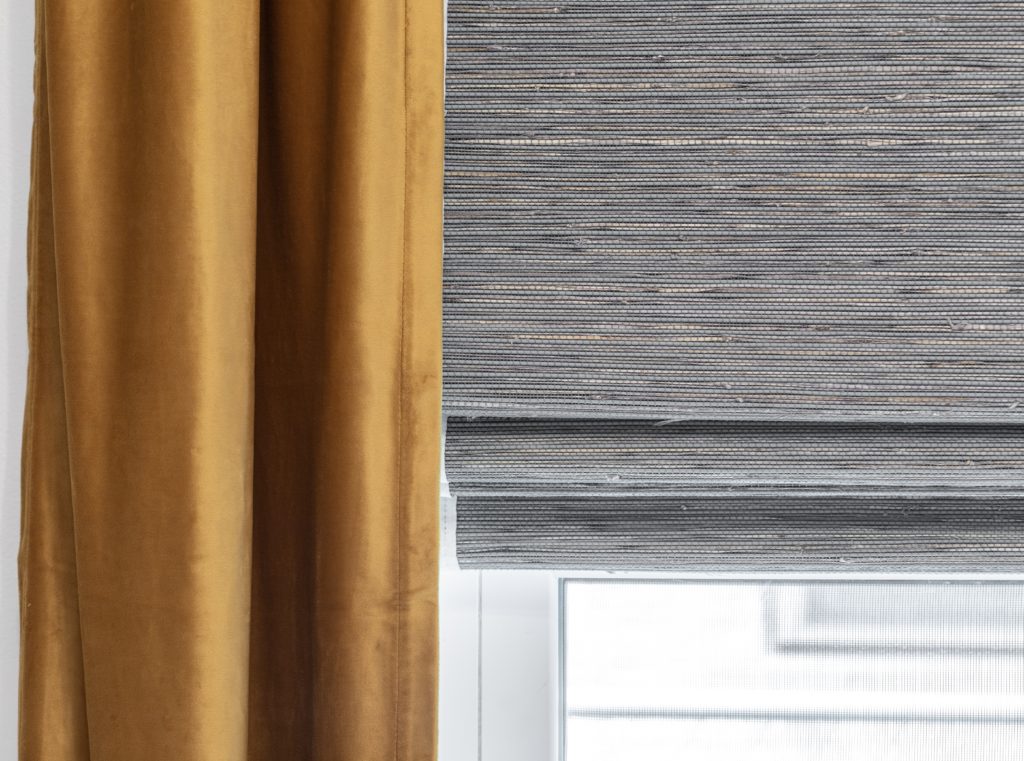
So I decided on woven wood shades and velvet stationary drapery panels. After looking at different swatches in different lighting, and referring to my concept board to make sure I was flowing within my color scheme. I went with a more traditional golden drapery color and a woven wood shade with blue and green undertones.
The Desk: Can’t Find It? Create It!
In my last blog, I shared my entire experience with getting this executive desk. Who knew you could find such a gem on Facebook Marketplace?! I’m not a natural thrifter, bargain hunter, or coupon shopper. I will pay full price without thinking twice. But when what you desire isn’t available at a premium price, you get creative.
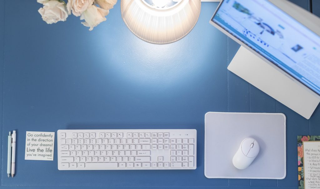
I still can’t believe I found this desk on the Facebook marketplace.
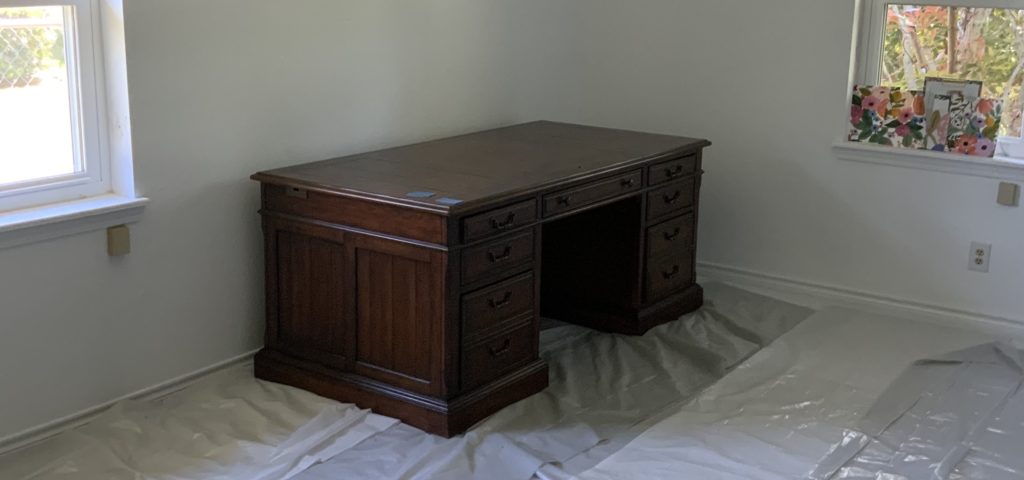
And transformed it with color…
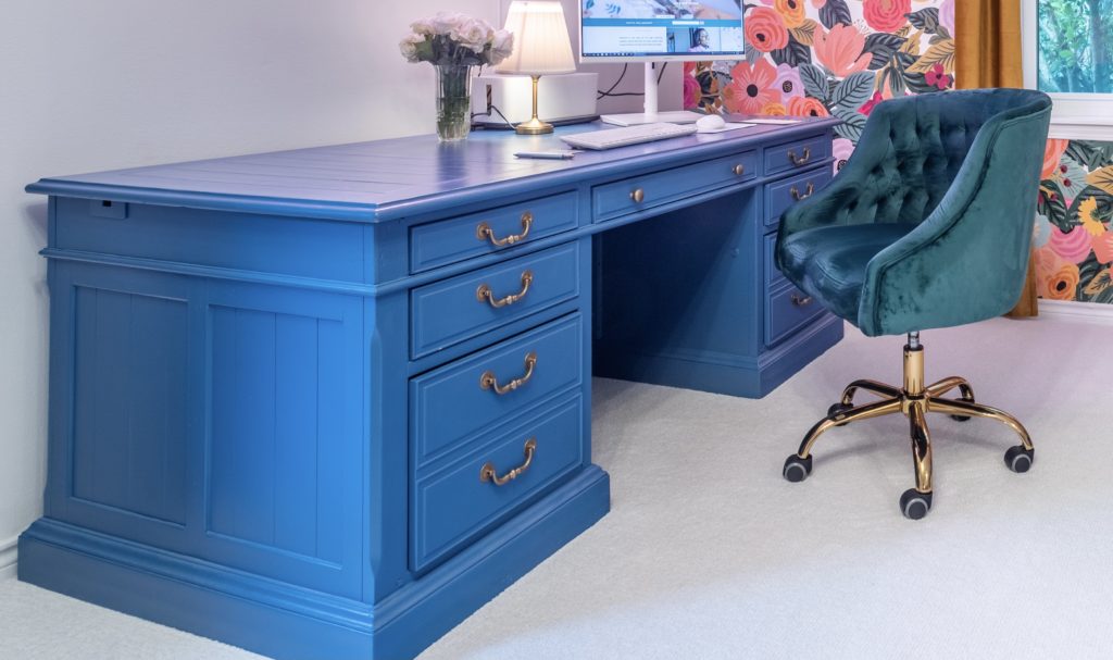
As you can probably tell, my style is traditional, classic with a pinch of modern glam. Color is a great way to add modern flair to a traditional piece without being full fledged modern.
Furniture: Vintage is everywhere.
Sooo vintage shops are all the rage and they have been for quite some time. But I’ll admit just like I’ve never been down for the homeless look—buying new jeans with holes in them—in the name of fashion; I’ve also never bought antique furniture—that’s on its last leg about to fall apart—in the name of vintage.
Sorry not sorry.
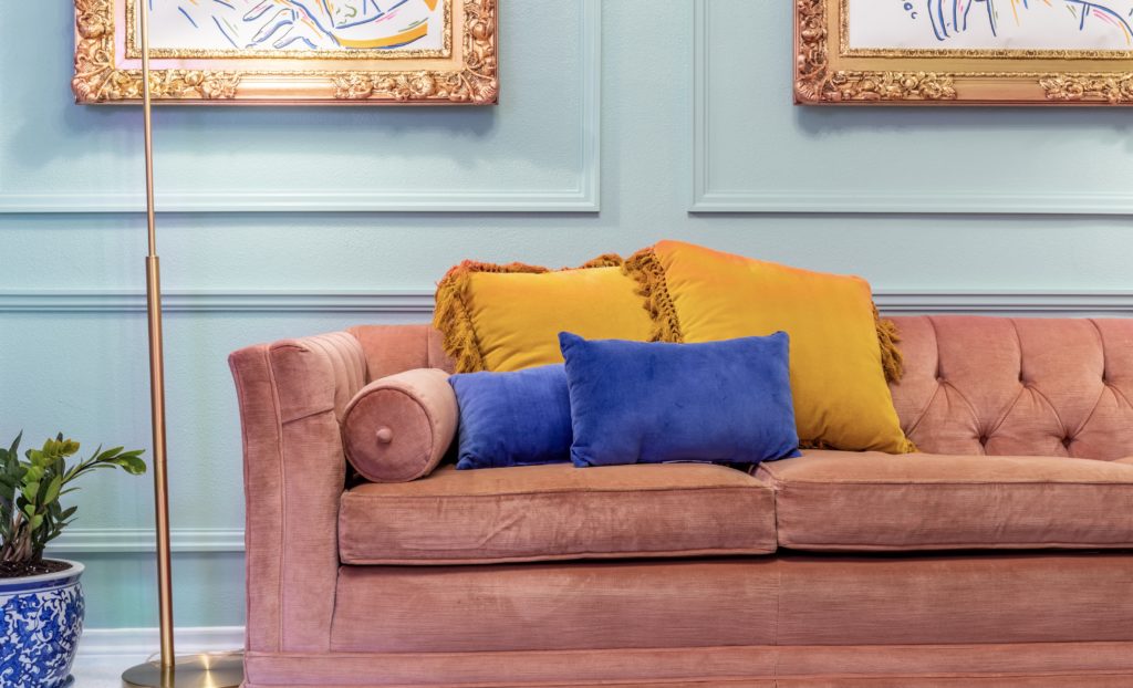
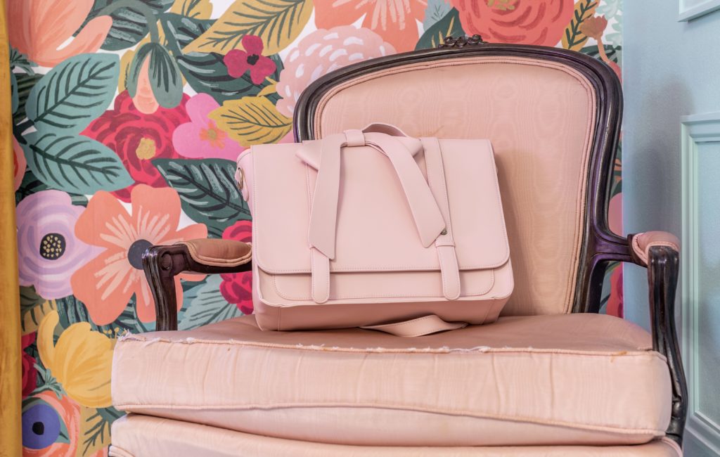
But I was pleasantly delighted that two vintage pieces that were gently used in my home went great in this room.
This pink chesterfield sofa.
And this pink Victorian mahogany carved chair.
And let there be light.
Outside of natural light, there are 4 light sources in this room—a recessed light in front of the closet, two floor lamps, and a chandelier. They’re all lovely and flow with the theme of this space. However, I wanted to liven it up and add a smidge of fun… *drum roll* a pink light!
What Makes My Heart Swoon: pink. It’s my favorite color of all time.
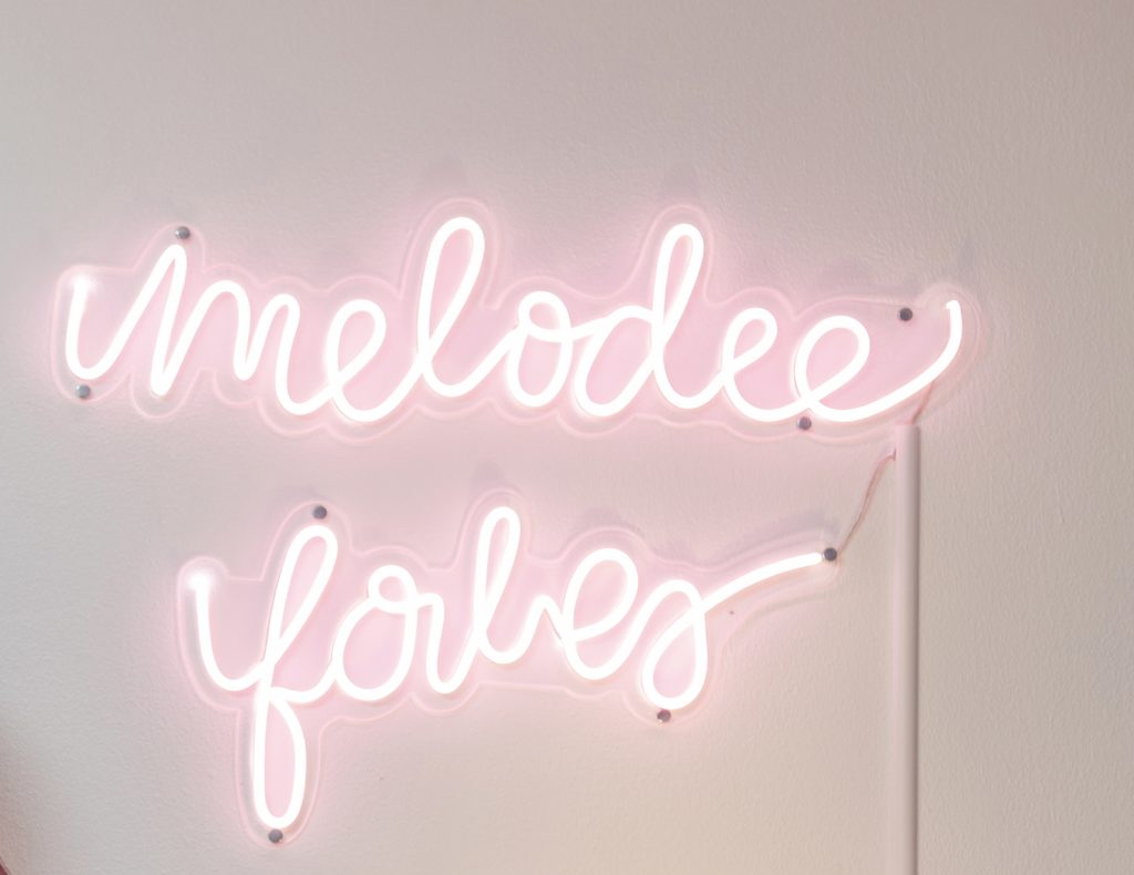
But first, I was concerned that the pink color may be too bright of a pink or too hot of a pink (and while I don’t discriminate and love all shades of pink equally— minus mauve, it’s an imposter!— for this room it had to be a LIGHT pink). And it turned out perfect.
This light not only lives up to the hype, but the customer service from this business was outstanding. Out of every product and company I ordered from their customer service was by far the definition of excellence. I’m rarely impressed, and I was floored by not only the quality of product, but the entire customer service experience. I could not recommend them higher.
Flooring: White Carpet? Oh my!
Did I mention how much I detest beige in a room? This isn’t just beige, it’s tan, brown, taupe, and any cookie cutter color that’s predictable and trendy not limited to beige but including the currently trendy gray as well. And guess what’s consistent in most carpets and flooring? You guessed it brown/beige or gray/charcoal.
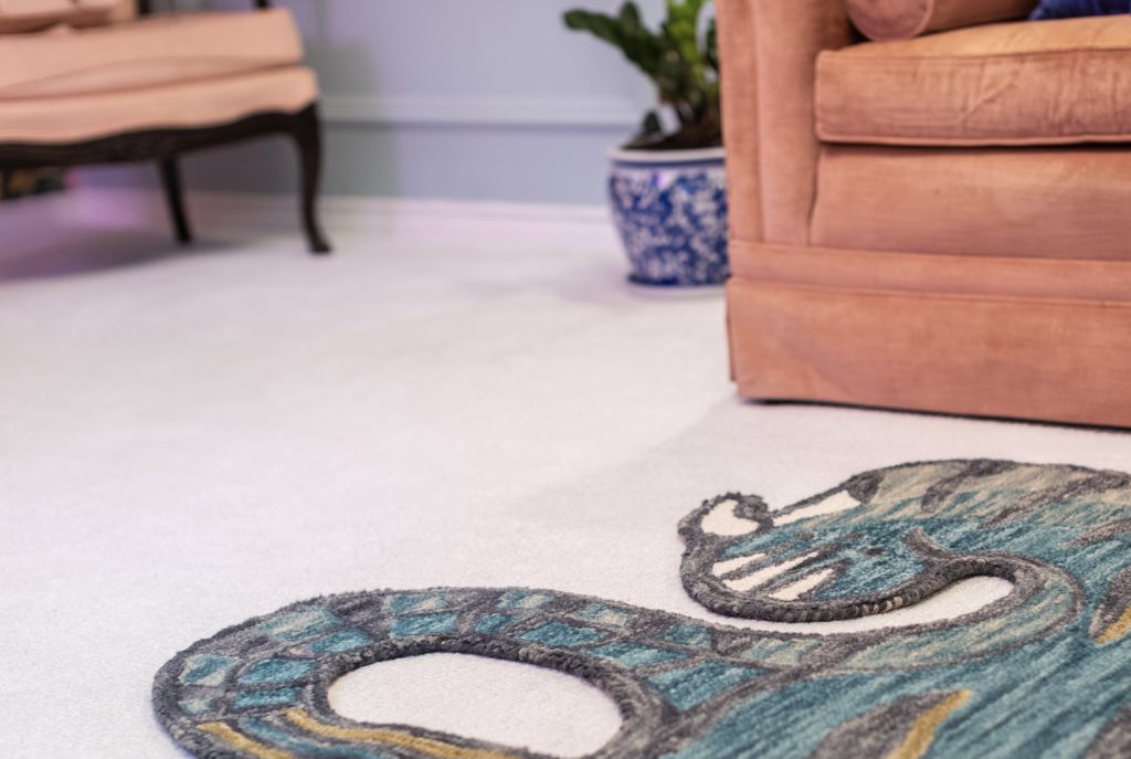
“But dirt will show up easier” is something I’ve heard from some who would like a white or light flooring color, but have little ones or pets in their home. For me, kids and pets aren’t good enough reasons to not get what I desire. And if dirt shows up, I’m going to see it and remove it just like I would with a darker color carpet.
What Else I Detest: black desktop monitors and televisions in rooms that are NOT dark. Similarly to cookie cutter beige and trendy gray… someone decided all technology devices should be black. It drives me bonkers, because it sticks out like a sore thumb and brings attention to functionality that isn’t beauty.
Metal Hardware: The Great Unifier & Other Details
One way to keep consistency and cohesiveness throughout your office is by having the same or complimentary hardware. I love brass. I find it classic, traditional, elegant, and warm. I didn’t just incorporate that with the lighting hardware and drapery rods, I incorporated it in seemingly minuscule details like door knobs, light switch and outlet covers.
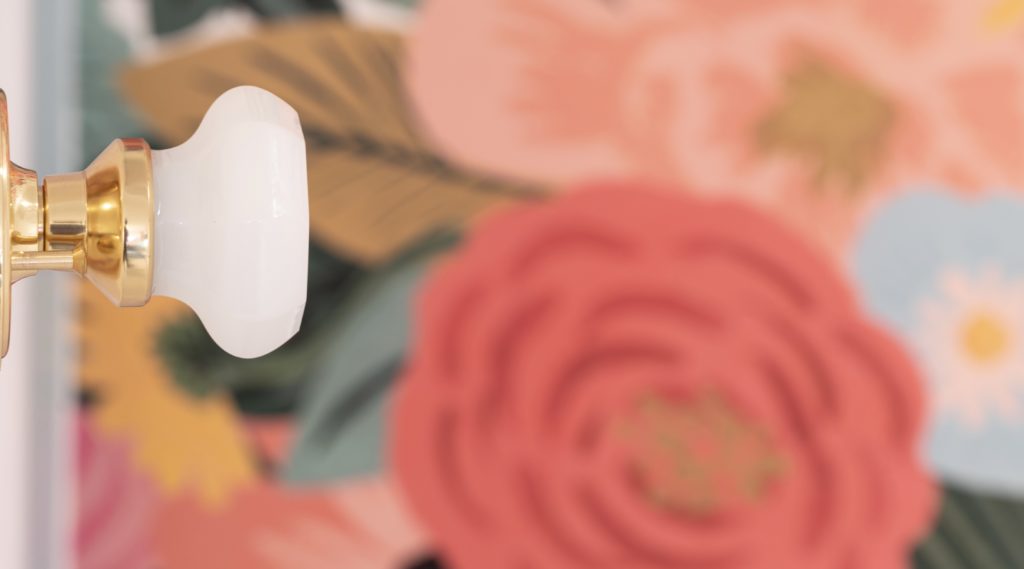
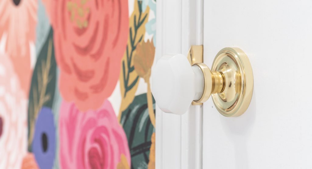
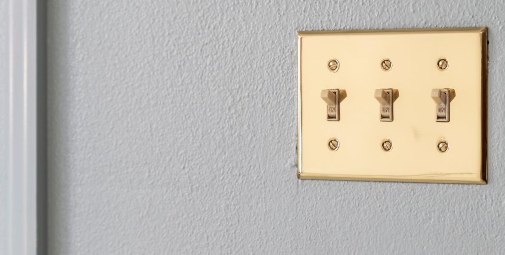
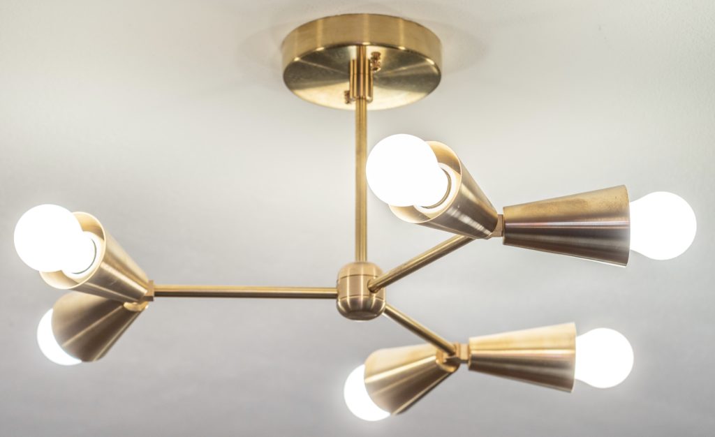
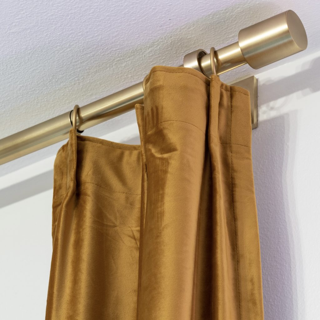
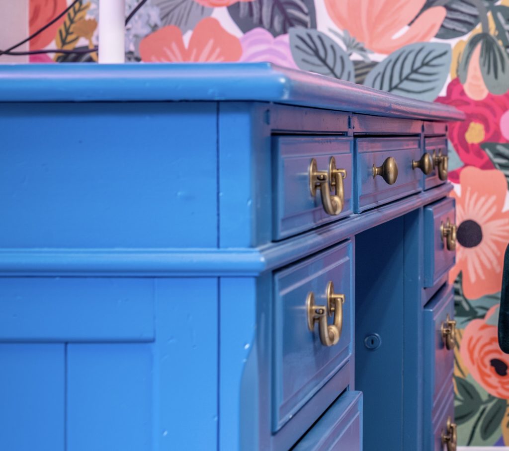
Imagine if I had chosen polished nickel, black iron, copper and rose gold? Three words: hot mess express. Consistency with metal hardware brings a unification and connection to the room like having the same color hangers brings unity to your closet.
What’s Next: Table & Television
Sooo while this room is 96.5% complete there are two components that I’ll add in the near future.
1) A coffee table (even though I don’t drink coffee, ha!) that fits the size and style of the room. I was so tempted to just buy something, but nope! If it doesn’t bring ME joy, it ain’t coming in this room… and nothing I’ve seen so far brings me joy nor fits the size requirements of the coffee table I need for my space.
2) A frame TV (even though I don’t have cable, occasionally watch Netflix, and really prefer YouTube) or some kind of tech that allows me to watch my favorites on a larger screen and/or function as a white board and be a mirror/art when turned off— in a frame color that’s white or gold (not black!).
Thank you for taking your most valuable asset— time — and reading this blog. I hope you enjoyed this dream studio home office reveal as much as I enjoyed sharing it with you. My prayer is that it inspires you to invest in your home, and create an environment that will positively impact your mindset.
Leave a comment below and share with me, what’s your favorite part of this studio home office reveal? It’d make my day to hear from you.
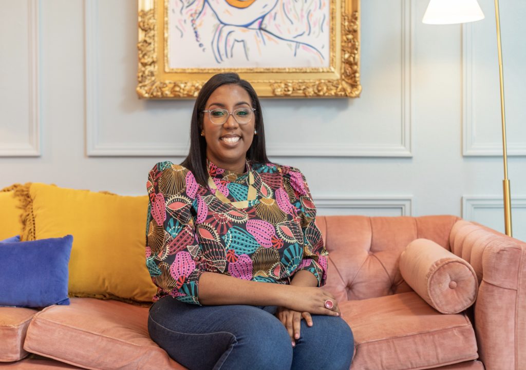
And if you’re new….Hi! I’m Melodee Forbes, and I design beautiful home offices for powerful women who work from home. If you’re ready to create your dream home office together, I’m your designer.

Shop the Look
Please note: Below are the disclosed sources for our dream studio office! While I understand that you, my dear reader, would love to shop/know details of this project please know that not all sources will be shared. To honor and respect your dream—the goal isn’t to be a carbon copy of mine, items that are custom, one-of-a-kind, or to the trade only will not be revealed. Retail items and/or similar options will include a referral link. Thank you for being a witness along this journey.
Artist: Nirianda Art
Frames: Lared of Frame Factory
Light: Neon Artisans
Paint: Claire
Photographer: Alex Wu
Wallpaper: Rifle Paper Co
Looks amazing! love the color palette!
Thank you JoJo!! Appreciate you reading the post and your kind words! ♥️
Beautiful Space. Trully inspiring. I am ready to create my space for me that will bring my the ultimate drive and desire out of me. I feel like once your space that represents you, the full and energy comes along and put your mind in overdrive.
Thank you for your kind words, Sabrina!! ♥️ So glad you found the reveal inspiring and I couldn’t agree more, the energy in an environment impacts your creativity and productivity.
Melodee! GURL!!! This right here makes me want to buy a house just so I can hire you to decorate the office. It’s gorgeous, beautiful, magnificent, and SO YOU!!! Keep sharing your amazing gift with the world! 💜
Thank you so much Rayven for your kind words!! I most certainly will continue. I’d be delighted to transform your home office whenever you’re ready! 💕
I absolutely love what you did with this room! It truly highlights your bright, beautiful and bold personality. I could feel your pride and joy through the text as I read it & was instantly smiling and joyful for you! I love this!
Thank you Stephanie! It was a joy to design! I appreciate your kind words. <3