


Whether you hire a designer, or tackle it yourself, you need to view your home project as a project. Flying by the seat of your pants didn’t work in college, at your first job, driving your first car, dating your husband, parenting your kids, or anything else worthwhile.
Winging it won’t work when creating a beautiful home and you’ll be disappointed every damn time.
What does work? Intentional planning. Your moodboard is a roadmap. It helps you stay focused and clear, so when you’re buying, shopping, spending, and creating — you’ll have a game plan and won’t be led astray by shiny objects, or 50% off sales.
In this blogpost, you’ll learn. . .
the three components that you need to include in your concept board.
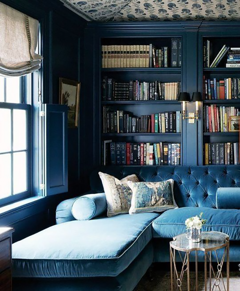
1 — Color — is one of the most important components to your concept board. It determines whether a room is warm or cool, and the overall mood of the room. You can play with 3 to 5 colors, but keep in mind you want them to flow.
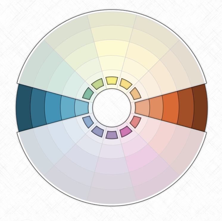
This is where color theory comes to play — an app that you’ll find useful is called the color wheel. Even the most seasoned professionals use tools that’ll help save them time and creative energy. What I love about this app is that you can use it to stay in alignment with colors that compliment, or contrast each other with one tap.
There are so many different color combinations, here’s a simple breakdown —
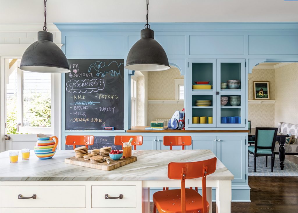
Complementary: using two opposite colors on the color wheel.
Would you pick blue and orange for a kitchen? Most of us wouldn’t, however, the beauty here is the shade of blue and the pop of orange. It’s a contrast, yes, and yet it still complements.
Triadic: three colors evenly spaced out on the color wheel.
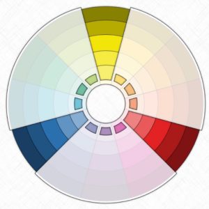
These three colors are strikingly opposed to one another and yet there’s still unity, this is what can happen with the triadic color scheme, especially when primary colors are used.
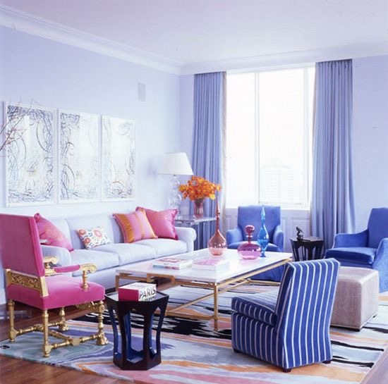
Analogous: three colors next to each other on the color wheel.
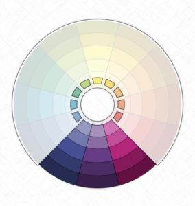
Notice how the lavender and violet are layered and flow so beautifully (and not competitively) along with the pink.
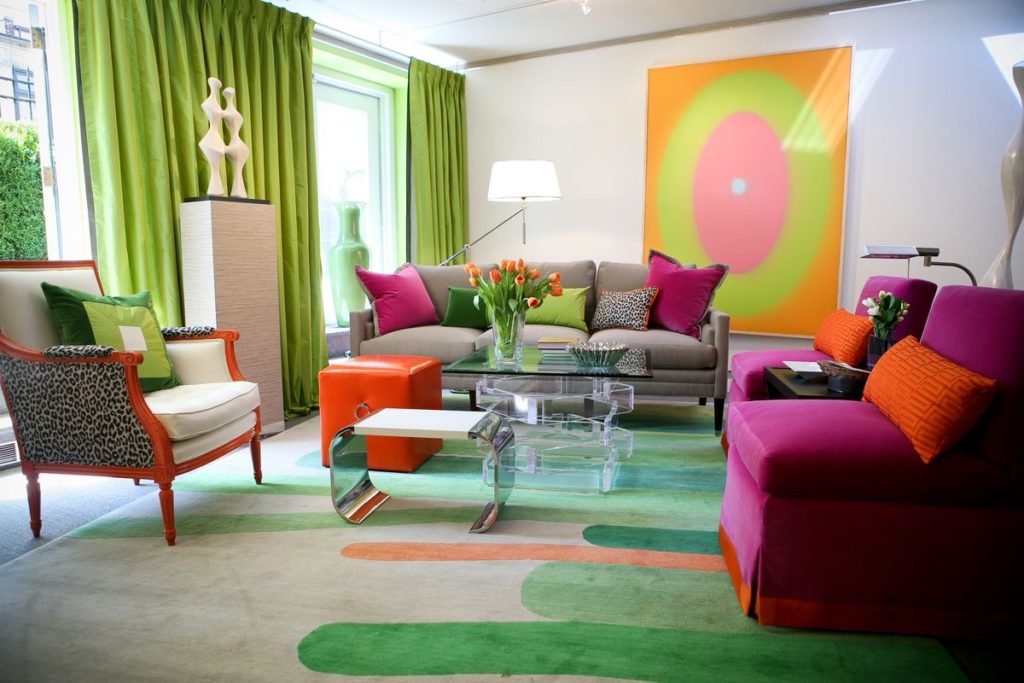
Split—Complimentary: a primary color is used with two analogous to its complement.
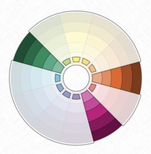
While the green is the primary color and the orange and pink are the other two colors, I’d question using the bright neon artwork as with the other bright colors it’s rather overwhelming.
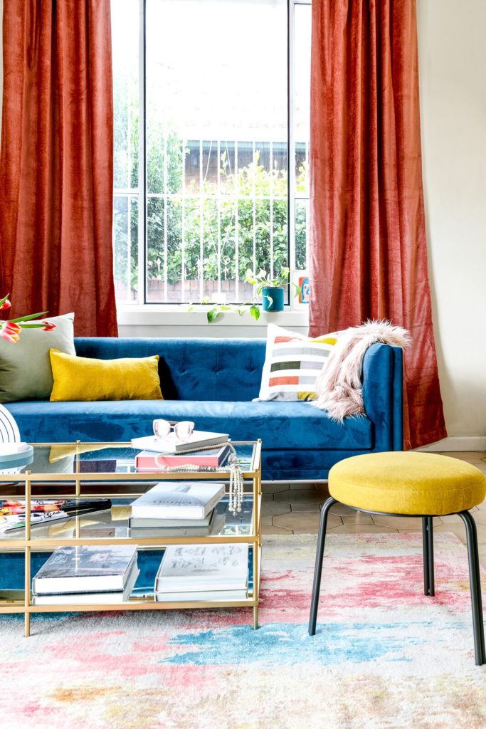
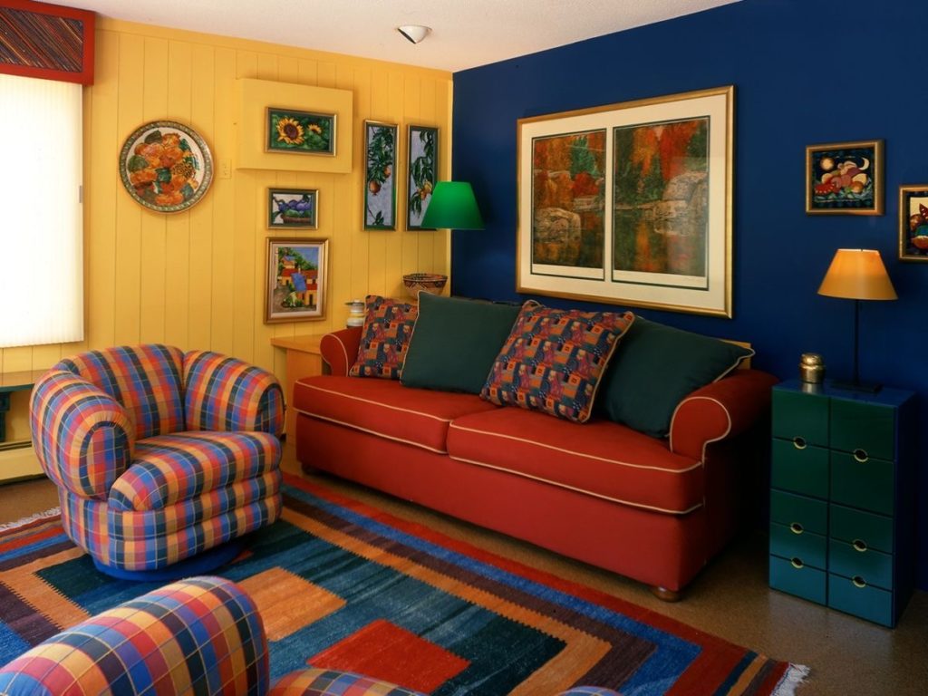
Tetradic: two sets of complementary colors.
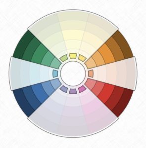
Red and green aren’t exclusively for Christmas, and can be paralleled with blue and orange if done right. While this is definitely giving me crayon-schoolteacher-vibes — it still works very nicely.
Monochromatic: only one color is used.
While you’ve seen color in different color schemes, it doesn’t have to be elaborate. You can keep it more simple, play with one color and experiment with patterns, textures, etc.
There’s also another color scheme called square, which is the combination of four colors equally spaced around the color wheel. But I wasn’t able to find a really good visual, so it’s safe to say, probably not one you want to consider. I’m kidding, I’ll update this post when I find one.
And of course this isn’t limited to color in spaces and rooms, you’ll notice it in logos, commercials, restaurants, etc. You can see why your color palette is crucial to your mood board, because before you decide on paint, wallpaper, furniture, lighting, hardware, window coverings, flooring or anything else — YOU NEED TO HAVE A COLOR SCHEME.
See how vast color can be? That’s why most homeowners stay safe and go with a beige/brown or gray/silver color scheme, because what’s not to love about that? Lots. Haha! I’m kidding. If you LOVE playing it safe in what I like to call boring beige, and overrated gray… more power to you! I love color so much! BUT at the same time there’s this thing called color theory, (which you just learned a bite-size, polka dot sampler of).
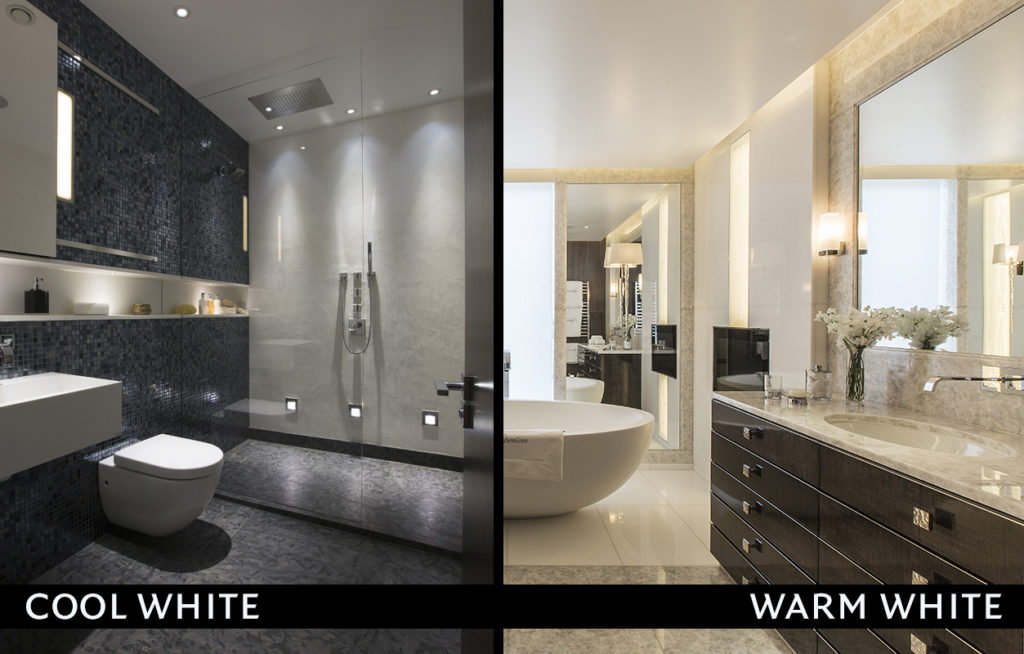
2 — Light — is the difference between a room feeling sterile like a hospital, or inviting like a family gathering. It’s one of the details that add intensity to the style. Let’s say your room is overall traditional, but you’d like to add a sprinkle of modern so it’s not too stuffy. You can achieve that with lighting.
Lighting Basics:
Hardware — brass, antique brass, chrome, stainless steel, polished nickel, copper, oil rubbed bronze, black iron, etc.
Bulb — warm or cool.
Shape — chandelier, pendant, lamp, fluorescent, recessed, ceiling, vanity, etc. and within the many shapes are a plethora of styles.
Personally, I love a big gorgeous, glamorous chandelier, BUT it isn’t always applicable in every room setting. There’s so many components to lighting, and when placed on your moodboard you’re able to see how it’ll go and flow, or how it won’t.
3 — Floor — is what permeates every aspect of your room. If you’re lucky enough to love your original flooring and it flows with your color palette, then you can skip this step and consider adding a rug or two or three.
Flooring Basics:
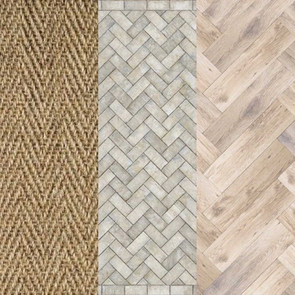
Type — carpet, wood, laminate, tile, marble,vinyl, concrete, etc. and depending on your selection will determine the texture (i.e. soft, smooth, sturdy, rough).
Pattern — lines, dots, geometric shapes, etc.
Functionality — do you have kids, dogs, or lots of traffic? You likely wouldn’t choose white carpet if you did. Durability makes a difference. This also applies to window coverings, you wouldn’t want silk draperies if you have cats.
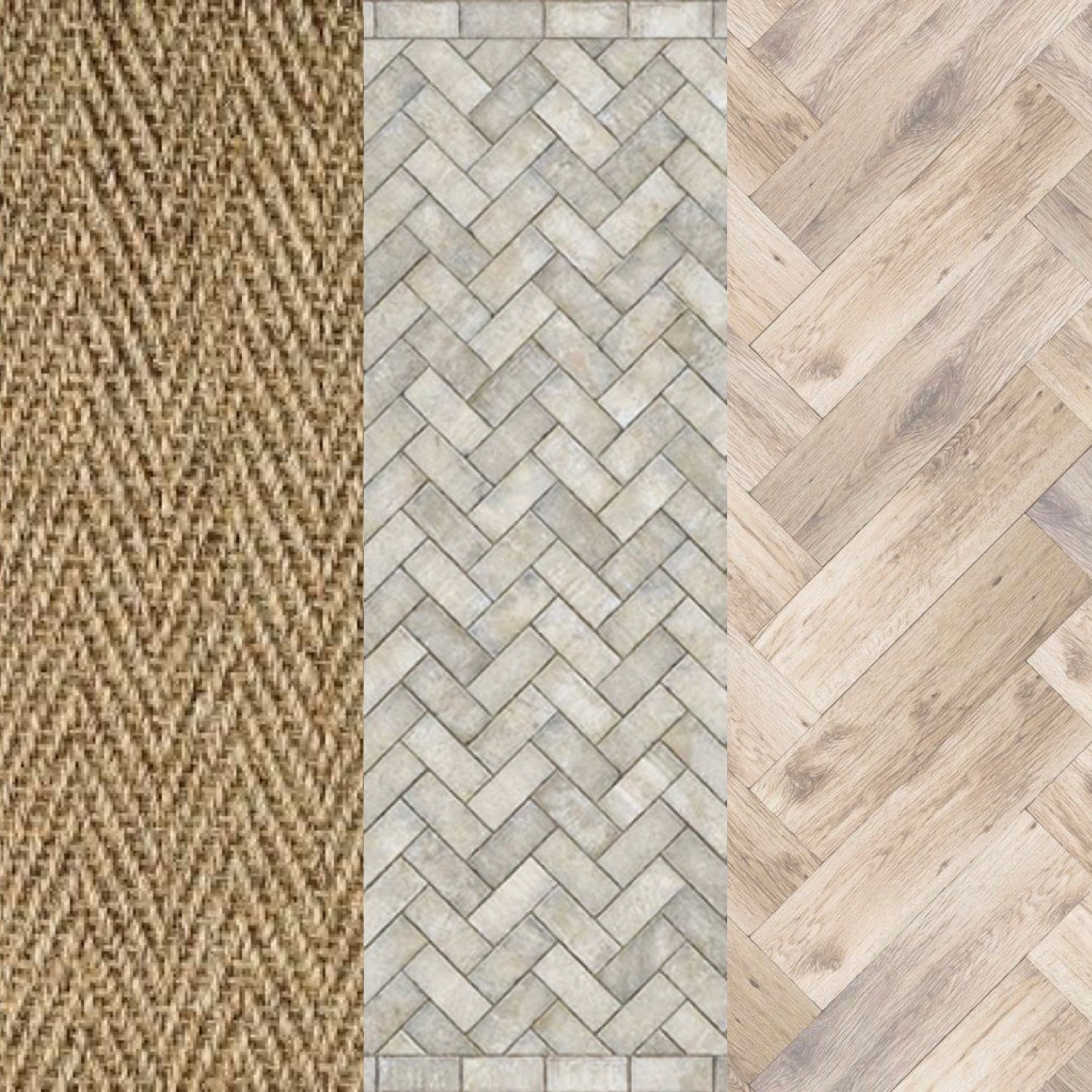
A popular flooring pattern is herringbone, you’ll see it below in carpet, vinyl, and wood.
There’s other components you can include in your moodboard, but as you can see if it I broke it down further — you’d be here all day. Plus, you have to decide what’s a best use of your time, if you’re a high achieving southern woman — you’re better off hiring an interior designer who can create your vision or give you ideas to spring forth from if you decide to tackle it on your own.
Was this blog helpful? If so, let me know by leaving a comment below sharing one idea you learned and/or what you’d like to see next!
with joy and delight,
Melodee Forbes
P.S. Stay tuned! Studio office makeover will be revealed this Spring!


[…] Tip: #5 Choose a color that compliments your color palette in your moodboard. […]